I find bug heat a useful way to determine the impact of a bug as it takes into account the number of duplicates, number of subscribers and quantity of people affected by the bug. Additionally, as a defect analyst for a team that is interested in bug reports about a large number of packages, I’d like to be able find out which of our bugs (across all our packages) have the greatest heat in Launchpad. It would be helpful to see this data in a chart so I can visually distinguish differences in heat and also have the bugs grouped by package rather than having them in a list ordered only by bug heat. (The chart will also help because Launchpad times out when creating the report for the foundations-bugs team.)
To this end I’ve collected data on the five hottest bugs for each package to which my team is subscribed. I’ve used it to make following chart which only displays packages where the package’s hottest bug is greater than 10% of the hottest bug overall.
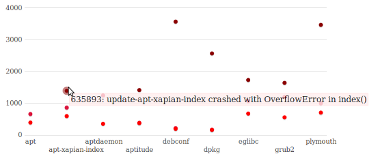
The chart will display the bug number and title when you mouse over a point on it. It is also possible to control which of the five hottest bugs are shown. Again, I’ve created these for the desktop, server, foundations and ubuntu-x-swat teams. There are also charts for every package set in Precise.